Rock the Vote – Outlook Voting Buttons
So today at the office I was faced with one of the more common and important questions that come up regularly and that was ‘Where are we going for lunch?’ This usually in tells a few minor arguments and what not especially if this involves a large number of people. About a year or so ago a former colleague of mine showed me this neat trick to help make the situation a little easier. In Microsoft Outlook there’s a feature that you can set up in any email that will allow the recipients of the email to vote on their favorite choice. After each person votes an email will be sent back to you with their vote and outlook will automatically tally up the results. Sorry for the poor resolution pictures in advance.
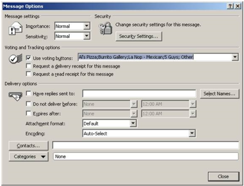
To start open up Outlook and start a new email as normal and once you’re finished click on the options tab and click on ‘Use Voting Buttons’ as seen below.

After you click on the option there are a few defaults’ you can select from or chose Custom.

Once this has been selected in the ‘Voting and Tracking Options’ you can add your custom button. When using the custom buttons make sure to separate each value with a semicolon. After that click close and you should
This is what the Email will look like and where they go to vote.
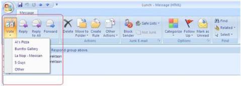
Another key point is to leave this in your Sent folder or the tally feature is not going to work. Now just sit back and watch all of the votes come in. Once some votes come in go back to your Sent folder and open the Email. Once the email opens click on the tracking button to see who voted for which item and the total tallies at the top for each option.

Migrating Crystal Report to SSRS
Next week on Aug 24th 2010 at 11AM EST I will be doing a free webinar in which I will take a crystal report and recreate that report in SSRS. In this session you’ll learn how your Crystal knowledge will port to SQL Server Reporting Services and what your overall project will look like as you prepare for the migration. This is the link if you would like to register for the webinar. https://www1.gotomeeting.com/register/511673321
This link will take you to the recording, sorry for the delay.
http://cms.pragmaticworks.com/Videos/Default.aspx?VidID=fb92370e7fe44f9abce82b95b02cf3e1
SSRS: Adding a Bing Map Layer
With the release of the SSRS 2008 R2 reporting developers now have a new tool that they can use when creating reports. The new tool I am talking about is the new map wizard. With this you can easily show totals by state to track whatever information your company is trying to track. When using the wizard there’re a few options that you can use when setting up the visual appeal of the report. By default you can use one of three options.
- USA by State
- USA by State Exploded
- USA by State Inset
By using one of those options you will get a map that will look like the example below.
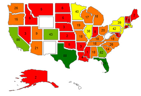
In my personal opinion these layers are a bit cartoonish and not the most professional looking especially since more than likely they will be on a dashboard but they do get the job done. Luckily for us there are a couple more options that we can use. Within the Map wizard there’s an option that you can use to add a Bing layer which is an aerial photo provided by NASA. In my opinion I think that this option is more refined and a bit more suited for business use as shown in the example below. I also think it adds a little bit of the Wow factor as well.
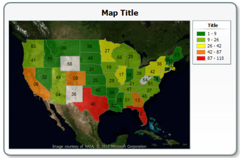
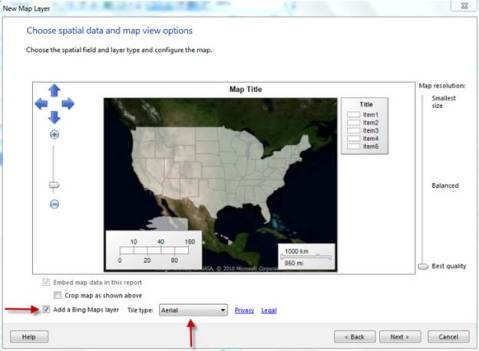
When creating the map using the wizard you have the option at the bottom on the screen to add a Bing Layer. You can simply click on the check box and then select which Tile Type as shown below. By doing this you will now have a Bing layer map.
Overlapping columns in SSRS
Today I was working on a report and stumbled across an issue that I was having while viewing the reports in the preview mode as well the production copy. The issue was that when I scrolled from left to right to view the report the columns started overlapping each other. The issue was in the grouping where there was a total line and that line had a background color to help make it more distinguished. While doing this was good for the visual appeal of the report but if you scrolled left to right it made the report hard to read and visual unappealing. A way around this is to give all of the other fields and columns a white background versus no background color. Now if you scroll from left to right the columns shouldn’t overlap.
